Shades of Blue (Psychological Effect in Interior)

COLOR THEORY: USING BLUE IN INTERIOR DESIGN
Summary:
This article explores various color tones within the Shade of Blue palette and examines how these tones can psychologically influence our mood when incorporated into interior design.
Additionally, we will explore the optimal areas within interior spaces to utilize Shade of Blue color tones and provide guidance on how to effectively combine them with other colors to achieve an enhanced overall outcome in interior design.
Before exploring the influence of Blue Color in interior design, it is important to note that interior designers highly favored blue for home color schemes. As one of the primary colors, it holds deep significance and offers versatile applications.
Being the only primary color associated with the "cool" family, Blue evokes a sense of nature and is believed to promote intelligence, serenity, and loyalty. Its ability to create a calming and soothing ambiance makes it an ideal choice for establishing a peaceful home environment.
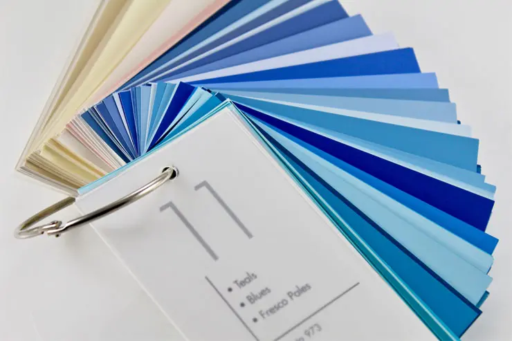
After selecting your preferred color from our Color Books, our team of experts is ready to offer additional support and insights regarding your chosen color palette. We can provide guidance on how to effectively incorporate it into your interior space, ensuring a cohesive and appealing design.

Psychology of Color Blue
The psychology of the color blue reveals its universal appeal and diverse associations. Blue is linked to calmness, serenity, dependability, loyalty, intelligence, productivity, and even sadness. However, in the realm of food, blue is often considered unappetizing due to its rarity in nature and instinctual avoidance. Observing the color blue can elicit various emotions and reactions. Therefore, it is very important to know your personality and consider using any color in your interior.

The Main Color Tones in the Shade of Blue can Include:
- Light Blue: A pale and gentle hue of blue, often associated with tranquility and calmness.
- Sky Blue: Resembling the color of a clear sky, it represents a bright and vibrant shade of blue.
- Baby Blue: A soft and delicate pastel blue tone reminiscent of a newborn baby's clothing.
- Turquoise: A vibrant blue-green shade that brings a sense of freshness and tropical vibes.
- Navy Blue: A deep, dark blue color associated with elegance and formality.
- Cobalt Blue: A vivid and intense shade of blue known for its richness and depth.
- Royal Blue: A bold and regal shade of blue, often associated with luxury and sophistication.
- Teal: A mix of blue and green, creating a unique shade that combines serenity and vibrancy.
These are just a few examples of the main color tones found in a blue color palette. There can be various shades and nuances within each tone, offering a wide range of possibilities for design and expression.

Where to Use the Blue Color?
Blue color can be utilized in various rooms within your interior.
- Living Room: In the living room, an appealing and fashionable blue sofa, armchairs, decor, and paintings can enhance the overall aesthetics.
- Kitchen: A dark blue kitchen paired with snow-white decorations and decor is a fantastic alternative to a more contrasting black kitchen.
- Bedroom: Blue is a beautiful color choice for the bedroom as it creates a serene and tranquil atmosphere, promoting a comfortable environment for relaxation and restful sleep.
- Child’s Room: Blue is an ideal option for a child's room, particularly when incorporating a sea theme or combining warm blue tones with vibrant and cheerful contrasts.
- Bathroom: Undoubtedly, blue, symbolizing the essence of the sea, is the perfect color choice for the bathroom.


Colors that Complement Blue Include:
- Orange: Blue and orange, being opposites on the color wheel, create a striking and visually pleasing contrast. Together, they convey a sense of balance and wholeness.
- Green: Warmer greens like emerald and turquoise harmonize well with cooler blue shades. Their similar brightness and saturation help create a cohesive and natural ambiance.
- Purple: Blues and purples, sitting adjacent to the color wheel, naturally complement each other. The combination evokes notions of nobility, luxury, and spirituality.
- Yellow: Lemon yellow serves as a high-contrast partner to navy and cobalt blues. This complementary pairing adds visual interest while maintaining a soothing visual effect.
- Red: Pairing blue with red tones such as burgundy and crimson creates a sophisticated and romantic color scheme. The vibrant contrast enhances the impact of both colors.
- Grey: Combining blue with various shades of grey, ranging from silver to charcoal, results in a stylish and neutral combination. The achromatic tones help balance the saturation of blue.
- White: White offers the highest contrast to navy and dark blues while remaining versatile. This combination produces a crisp and clean aesthetic, often associated with nautical or winter themes.
Attention: Where should the Blue Color be Avoided?
- If you wish to use a rich blue color in the interior, you need to be careful. Blue tones love the sun and natural light. Therefore, you can safely use them in rooms whose windows face south, southeast, or southwest. However, in shady rooms, not illuminated by direct sunlight and facing north, blue color can make them cold and gloomy.
- Avoid using a significant amount of dark blue in expansive rooms, as it can create a gloomy and melancholic atmosphere. Instead, opt for lighter shades such as sky blue, light turquoise, or lavender to brighten the space. In this scenario, vibrant and saturated shades of blue can be used as contrasting accents, such as on puffs, armchairs, curtains, pillows, or paintings.


")


