Creams and Off Whites (Psychological Effect in Interior)
This article explores the neutral tones of Cream and Off-white, examining their psychology, significance, and impact on interior design. Off-white includes shades like cream, eggshell, ivory, and vanilla, each subtly different from pure white. We'll first discuss cream color, then focus on off-white shades' specific characteristics and uses in interior settings.
Quick Overview: This article explores the following topics:
1- Cream Color
- Introduction to Cream Color
- History of Cream Color
- Symbolism and Psychological Impact of Cream Color
- Using Cream Color in Interior Design
- Different Range of Cream Colors
- What are the Best Curtain Colors for Cream Walls?
- Overview of the Effects of Cream Color in Interior Design
2- Off-white Color
- Overview of Off-white Color
- Historical Background of Off-white
- Symbolism and Psychology of Off-white
- Varieties of Off-white Colors
- What Color Goes Well with Off-white?
- Where to Use Off-white Colors in Interior Design?
- How to Integrate Off-white Color to Your House?
- Summary of Off-white in Interior Design
Cream Color:
Overview of Cream Color
In simple terms, cream color is created by mixing white with a touch of yellow, or, in a professional term, the cream color with HEX #FFFDD0; it consists of 100% red, 99.2% green, and 81.6% blue.

History of Cream Color in Interior
Cream is a soft and elegant shade often associated with luxury and style, resembling a light yellow. With its rich historical and emotional significance, the cream is favored in fashion, interior decorating, and product design. It became popular in the 18th century as a stylish alternative to bright colors in women's fashion and clothing. In the 19th century, cream found its way into interior design, frequently combined with luxurious fabrics and detailed furniture to evoke a sense of luxury and sophistication.

Symbolism and Psychology of Cream Color in Interior
Cream represents purity, elegance, and luxury, which is why it is popular in high-end fashion and interior design. In wedding traditions, it symbolizes purity and innocence.
From a psychological standpoint, cream exudes a calming and soothing effect, promoting relaxation and tranquility. It is particularly sought after for bedroom decor, as it can establish a peaceful and serene ambiance. In product design, cream evokes a sense of elegance and sophistication.

Using Cream Color in Interior Design
Cream is a popular color in home decor, commonly used on walls, furniture, and accent pieces. Additionally, it is a favored choice for bedding and window treatments, adding a touch of elegance and versatility to interior spaces.

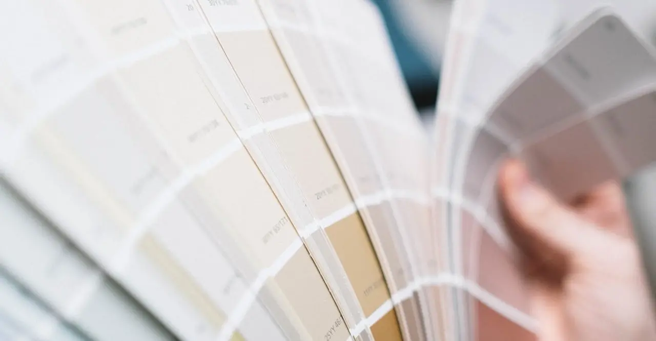
Different Range of Cream Colors
Cream colors encompass a range of shades that vary in intensity and undertones. Here are some examples of different cream colors:
- Pale Cream: Pale Cream is a mid-tone yellow with a muted, slightly greenish hue, giving it a fresh and lively feel compared to the warmth of orange-toned yellows.
- Ivory Cream: Although ivory includes a hint of yellow, it still conveys feelings and messages similar to pure white, such as calmness and purity. Additionally, the meaning of ivory color also signifies formality and luxury.
- Beige Cream: A hint of tan or light brown to cream color will create a beige cream color.
- Champagne Cream: Champagne is a mixture of yellow and orange and closely resembles beige.
- Pearl Cream: A creamy shade with a pearlescent sheen resembling the lustrous surface of pearls.
- Rosy Cream: A cream hue with a subtle pink or rose undertones, adding a delicate and feminine touch.
- Sand Cream: A cream color incorporating sandy undertones, evoking a natural and earthy feel.
These are just a few examples. Various other cream colors are available, each with unique characteristics and variations.

What are the Best Curtain Colors for Cream Walls?
Having cream-colored walls in your home provides a flexible backdrop for decorating and design. You can enhance the look of your space by choosing the right curtain colors. Here are some suggestions:
- Soft Blue Curtains: If you prefer a subtle and hazy look, complement your cream walls with soft blue curtains. This color combination maintains a soothing atmosphere while creating visual contrast.
- Green Curtains: Green curtains offer a beautiful contrast against light cream walls, adding brightness and a touch of nature-inspired aesthetics. Consider incorporating small potted green plants for an enhanced theme.
- White Curtains: Don't underestimate the power of combining neutral shades. White curtains with cream walls create a pristine and clean appearance, adding layers of elegance to your space.
- Gray Curtains: Gray has become a favorite among interior designers due to its versatility and sophistication. Gray curtains paired with cream walls bring any room a sense of character and style.
- Purple Curtains: Embrace a touch of elegance with purple curtains alongside cream walls, adding a subtle yet luxurious atmosphere.

For more detailed information, feel free to contact our team of experienced designers. Don't hesitate to contact us for further assistance and personalized advice.
Overview of the Effects of Cream Color in Interior Design
In short, cream color represents sophistication and elegance, with a rich fashion and interior design history. Its calming effect makes it perfect for creating peaceful spaces, especially in bedrooms. Cream color can be used in various ways, such as for walls, furniture, and accents, to add a touch of elegance to any room. By exploring different shades of cream, you can bring a timeless and tranquil beauty to your living space.

Off-white Color:
Off-White Color Information
Off-white refers to shades slightly different from pure white, such as cream, eggshell, ivory, and vanilla. It doesn't have a specific hex code, but similar shades like ivory (#FFFFF0), Whitesmoke (#F5F5F5), and Snow (#FFFAFA) do.
Off-white is more a category of white variations than a distinct color. To create off-white paint, typically, you need to add a small amount of yellow or brown to white paint, as adding black may lead to grey instead. Off-white is ideal for designs requiring a softer, more muted aesthetic than pure white.

History of Off-White Color
Off-white color has been around even before it was formally identified, with its various shades acknowledged throughout history; "ivory" was named as early as 1385, while "vanilla" wasn't named until 1925. Off-White is also a luxury fashion label by designer Virgil Abloh. However, if we are talking about the white color itself, it is one of the earliest colors in art and was used by Paleolithic artists who utilized white chalk and calcite for cave paintings during the Stone Age.

Use of off-white color at Kakadu National Park Ancient Paintings
Psychology of Off-white Color
Research has shown that the color of a room can profoundly influence a person's emotions and mood. Studies suggest that off-white and similar light hues can help relieve stress and anxiety, fostering a peaceful and serene ambiance. Additionally, off-white enhances the comfort and relaxation of a space, which is especially advantageous in settings like bedrooms and living rooms.

Symbolism of Off-white Color in Interior
Off-white represents feelings of purity, cleanliness, and tranquility. Its neutral characteristics make it highly adaptable, effortlessly complementing various colors and designs, thus making it a popular choice in interior decorating. When applied to walls, off-white creates a perception of more light and space and contributes to a peaceful and relaxing environment.

Different Range of Off-White Colors
Off-white is an umbrella term for shades that differ slightly from pure white. Some of the standard off-white shades are:
- Snow White: One of the most popular off-white colors is "Snow White." It is a pure white shade that gives any space a clean and crisp appearance. Ideal for minimalist designs, it complements natural materials like wood and stone.
- Whitesmoke: For those seeking a slightly cooler off-white option, "Whitesmoke" is a great choice. It has a faint blue undertone, providing a refreshing and calming effect. This shade harmonizes well with cool colors like blues and greens.
- Frosty White: If you desire an off-white shade with more depth, consider "Frosty White." It has a slight beige undertone, adding warmth and a welcoming ambiance to a space. It complements natural materials such as wood and leather.
- Paper White: Lastly, "Paper White" offers a subtle off-white shade with a slight gray undertone. It creates a muted and relaxed look, perfect for establishing a tranquil and calming environment.
- Cream: We explained this one in-depth in the first part of this article.

What Color Goes Well with Off-White?
Off-white works well as an accent and background color for any color. It pairs beautifully with black and gold to create a luxurious feel. Additionally, off-white can amplify the brightness of yellows and oranges or bring out the richness of deep blues and greens.

Where to Use Off-white Colors in Interior Design?
Off-white colors are incredibly versatile and fit effortlessly into any room. Here are some tips for incorporating off-white into different rooms:
- Living Room: For a cozy and inviting living room, combine off-white walls with comfortable furniture pieces in warm tones. Add textured throws and pillows in complementary colors to enhance the cozy ambiance.
- Bedroom: To create a serene and relaxing bedroom, paint the walls in an off-white shade and layer the space with white linens, textured rugs, and natural wood furniture.
- Bathroom: Transform your bathroom into a spa-like retreat by pairing off-white walls with white marble countertops and sleek chrome fixtures. Introduce warmth through the use of wood accents and natural stone tiles.
- Kitchen: To achieve a bright and airy kitchen, paint the walls an off-white shade and pair them with white or light-colored cabinets. Inject visual interest by incorporating colorful backsplash tiles or statement lighting fixtures.

- Home Office: For a sophisticated and elegant home office, combine off-white walls with dark wood furniture and accents in gold or brass. Add texture to the space with a plush rug and luxurious velvet curtains.
How to Integrate Off-white Color to Your House or Space?
- Walls, Wallpaper, or Ceilings: Painting your walls and ceilings off-white can create a soft backdrop that makes your space feel larger and brighter. You can also use our selection of many available off-white color-tone wallpapers. Off-white works well in rooms with a lot of natural light, and in those that are a bit darker, it can help brighten the space.
- Textiles and Upholstery: Consider off-white for items like sofas, curtains, and bed linens. It adds a touch of elegance and can be easily complemented with colorful throws, cushions, or rugs for a more vibrant look.
- Cabinetry and Furniture: In kitchens and bathrooms, off-white cabinets can create a clean, fresh look that feels timeless. Similarly, off-white furniture can help make the space feel serene and calming.
- Flooring: Off-white flooring, whether it's carpet, tiles, or wood, can help to open up a space. It's particularly effective in smaller rooms or apartments where you want to maximize the sense of space.
- Accessories and Decor: Small touches of off-white in items like lampshades, picture frames, and decorative objects can help to unify a room's color scheme without overwhelming it.
- Mix with Other Shades and Textures: Off-white pairs beautifully with wood, metals, and other neutral shades. Mixing textures like a fluffy off-white rug on a hardwood floor can add depth and interest to your space.
- Art and Wall Hangings: Framing art with off-white mats or choosing heavy off-white sculptures can add a subtle sophistication to your décor.
- Layer Different Tones: Use a variety of off-white shades together to create a layered, monochromatic look. This can add complexity and subtlety to your design without using solid colors.

Conclusion on Off-white Color Impact in Interior Design
In conclusion, while off-white colors may initially appear modest, they possess numerous advantages that enhance any space's ambiance. Whether you aim to establish a tranquil and peaceful atmosphere or an upscale and refined home, off-white colors serve as a neutral backdrop that effortlessly complements any style or color scheme. When contemplating your next paint color or decor choice, please don't overlook the allure of off-white and the endless possibilities it holds for transforming your space.


")


